How Can an Outfit Guide Elevate a Fashion Photographer’s Phone Shots
Ask The Expert: A Fashion Photographer’s Guide to Stunningly Chic Phone Shots
Fashion photography has evolved beyond the studio. With advanced phone cameras and refined styling, professionals now capture editorial-grade visuals on the go. The secret lies in how fashion choices interact with mobile camera technology. A precise outfit guide doesn’t just coordinate colors—it directs mood, texture, and story. When styling aligns with sensor behavior and lighting dynamics, even a handheld shot can look like a magazine spread.
The Connection Between Fashion Styling and Mobile Photography
Fashion styling defines the emotional tone of an image before a single frame is taken. In mobile photography, where lighting and depth are limited, styling becomes the narrative backbone that guides visual cohesion.
Understanding the Role of an Outfit Guide in Visual Storytelling
An outfit guide acts as a blueprint for visual harmony between clothing, environment, and subject. It ensures each element supports the same mood—be it casual streetwear against city concrete or flowing fabrics in coastal light. Coordinated styling deepens narrative impact by linking texture and silhouette to emotion. Attention to fabric weight, structure, and color balance can elevate even basic mobile imagery into layered storytelling.
How Outfit Planning Shapes the Photographer’s Creative Vision
When outfits are pre-planned, concept development becomes more efficient. Instead of improvising on set, photographers can focus on framing and light manipulation. Consistent wardrobe direction also reinforces brand identity; this matters for editorial consistency across campaigns or social feeds. Structured styling choices reduce visual noise, allowing form and gesture to take center stage—a principle often seen in minimalist fashion editorials where clarity trumps excess.
The Technical Synergy Between Fashion Choices and Phone Camera Capabilities
Smartphone cameras interpret color and light differently than DSLRs. Fashion stylists who grasp these nuances can tailor wardrobe palettes that complement sensor limitations rather than fight them.
Optimizing Color Palettes for Smartphone Sensors
Certain hues appear exaggerated or muted depending on sensor calibration. Warm tones like terracotta or mustard often photograph richly under natural light but risk oversaturation indoors. Neutral shades—cream, taupe, soft gray—tend to yield cleaner exposures with less digital noise. Contrasting colors such as cobalt blue against beige backgrounds enhance perceived depth in flat lighting conditions common to mobile photography.
Leveraging Fabric Textures for Depth and Dimension
Texture translates differently through small lenses. Silk reflects highlights smoothly, denim absorbs shadows deeply, while leather introduces subtle gradients that mimic professional depth-of-field effects. Proper lighting—side-lit or backlit—can emphasize fabric movement, giving tactile realism to phone shots. Texture-focused compositions also add sophistication to minimalist frames where every detail counts.
Strategic Use of Outfit Guides in Location-Based Shoots
Location defines context; wardrobe defines resonance within that context. A well-prepared outfit guide bridges both by predicting how materials react under specific environmental conditions.
Aligning Wardrobe with Environmental Contexts
Wardrobe should echo its setting’s tone—urban shoots favor structured silhouettes; natural settings invite flowy fabrics; architectural backdrops call for geometric cuts or monochrome schemes. Complementary color coordination prevents distractions from background elements like graffiti or foliage. Seasonal attire also affects how light interacts with skin tones and materials—for example, wool absorbs winter sunlight differently than linen under summer glare.
Balancing Practicality and Aesthetic Intent During Outdoor Sessions
Outdoor sessions demand adaptability. Lightweight fabrics allow free movement during variable lighting changes throughout the day. Layered outfits enable quick restyling without interrupting workflow when clouds shift or wind rises unexpectedly. Footwear selection is critical not only for aesthetic alignment but also for stability during long shoots across uneven terrain—a factor often overlooked until fatigue sets in mid-session.
Enhancing Composition Through Coordinated Styling Elements
Composition extends beyond framing; it begins with what subjects wear and how accessories interact with negative space within the frame.
Using Accessories as Visual Anchors in Frame Composition
Accessories like belts or jewelry serve as focal anchors guiding viewer attention toward desired points—such as facial expressions or hand gestures. Repeating accessory tones across scenes builds visual rhythm while maintaining balance within compositions. Minimalist accessory use prevents hierarchy confusion where too many metallics or patterns compete for attention.
Integrating Patterns to Reinforce Movement and Flow
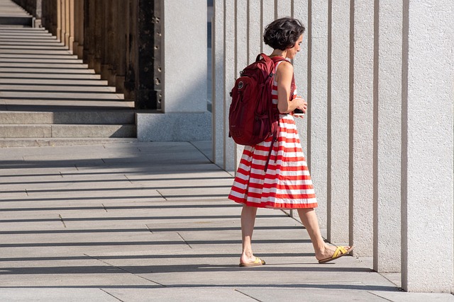
Patterns introduce motion cues within still images. Stripes direct gaze lines horizontally or vertically depending on composition intent; geometric prints create dynamic tension when paired thoughtfully with plain textures nearby. Repetition of subtle motifs across multiple subjects enhances unity in group portraits while avoiding clashing prints preserves overall harmony across frames.
Post-Shoot Refinement: Editing with Styling Consistency in Mind
Editing is where fashion choices meet digital craftsmanship. Maintaining fidelity between original fabric tones and postprocessed outputs keeps brand aesthetics intact across platforms.
Maintaining Color Integrity During Mobile Postproduction
White balance adjustments must remain subtle to preserve outfit accuracy under mixed lighting sources such as LED interiors versus daylight exteriors. Selective saturation tweaks help retain textile authenticity without distorting hues—especially critical for brand campaigns featuring signature colors. LUTs or presets should complement rather than overpower wardrobe palettes; restraint here separates professional edits from over-filtered trends.
Cohesive Presentation Across Digital Platforms
Consistency across digital grids strengthens identity recognition instantly visible to audiences scrolling at speed. Sequential posting based on wardrobe palettes creates narrative continuity—viewers subconsciously follow color progression like chapters in a storybook sequence. Uniform editing styles unify disparate shoots into one coherent aesthetic language suitable for portfolio curation or branded storytelling arcs on social media.
FAQ
Q1: Why is an outfit guide essential for mobile fashion photography?
A: It provides structure that aligns clothing choices with lighting conditions, ensuring coherence between subject mood and location tone even when shooting spontaneously on phones.
Q2: How do smartphone sensors affect color accuracy?
A: Smaller sensors handle contrast differently; bright reds may clip highlights while neutrals maintain balanced exposure under varied light sources.
Q3: What fabrics photograph best on phones?
A: Materials with moderate sheen like silk blends or matte textures such as cotton twill record detail clearly without overwhelming lens contrast limits.
Q4: How can accessories improve composition?
A: Strategically placed accessories act as directional markers guiding viewer focus toward key visual points within a frame’s layout.
Q5: What editing practices maintain fashion integrity post-shoot?
A: Subtle white balance correction combined with restrained saturation keeps garment colors true-to-life while preserving stylistic consistency across final outputs.