How to build a design style guide for a fashion brand
What a design style guide does in fashion
A design style guide is a working rulebook for keeping a fashion brand visually and stylistically consistent. It applies to clothing, photography, lookbooks, e-commerce pages, packaging, social content, editorial features, and any other customer-facing material. It does not replace creative judgment. It gives designers, stylists, writers, photographers, merchandisers, and content teams a shared reference for making choices that feel connected.
For a clothing or fashion site, the guide should answer three questions quickly: what the brand should look like, how the clothes should be styled, and how every customer-facing detail should feel. A useful guide is specific enough to prevent off-brand work, but flexible enough to support new collections, seasons, collaborations, and trend shifts.
This article focuses on a fashion-specific structure rather than a generic corporate brand manual. It covers the visual system, apparel styling rules, content tone, photography, digital presentation, and maintenance process needed to make the guide practical in daily work.
Start with the brand idea before choosing visuals
A style guide becomes weak when it starts with fonts and colors before defining the brand idea. In fashion, visual choices need an emotional and commercial center. A minimalist tailoring label, a relaxed streetwear brand, and a romantic occasionwear collection may all use strong photography and clean typography, but their decisions should not feel interchangeable.
Start with a short brand position statement. It should describe the customer, mood, cultural references, and design values behind the clothing. Keep it practical rather than poetic. If the statement is too vague, it will not help a photographer choose a background or a stylist decide whether a look should feel polished, undone, classic, or experimental.
Define the style territory
The style territory explains where the brand sits visually. It may include words such as refined, utilitarian, expressive, understated, structured, fluid, vintage-inspired, technical, resort-focused, or workwear-driven. Each word should be linked to a design implication, not left as a mood-board label.
- Refined may imply restrained color, polished lighting, and controlled styling.
- Utilitarian may imply functional details, practical layering, durable textures, and direct product copy.
- Expressive may imply bolder color combinations, dynamic poses, and stronger editorial art direction.
- Understated may imply negative space, quiet typography, and a limited accessory language.
This step prevents the guide from becoming a mood board with no operating rules. It turns taste into a decision-making system.
Separate timeless codes from seasonal experiments
Fashion changes constantly, but a brand should not rebuild its identity every season. A strong design style guide separates permanent codes from temporary expressions. Permanent codes may include logo usage, core color families, preferred silhouettes, photography mood, model direction, and writing tone. Seasonal experiments may include accent colors, campaign props, limited-edition graphics, or trend-led styling.
This distinction is especially useful for brands that publish frequent fashion content. On a site like Shuaigo, broader Style Guides can explore seasonal outfit ideas, while the brand-level guide keeps the visual and editorial foundation consistent.
Build the visual identity section
The visual identity section is the part most people expect from a design style guide. It should be clear, visual, and easy to apply. Avoid long explanations when examples can do the job faster. A team member should be able to open this section and understand what is allowed, what is preferred, and what should be avoided.
Logo and mark usage
Include the primary logo, secondary logo, wordmark, icon, and any special lockups. Show minimum clear space, minimum size, background rules, placement examples, and common mistakes. For fashion, logo rules should also consider garment labels, hangtags, packaging, campaign images, website headers, social avatars, and watermark use.
If the brand uses a subtle identity system, the guide should specify when not to use the logo. Luxury, minimal, and editorial fashion brands often rely on atmosphere and product detail as much as the visible mark. The guide should make that balance intentional.
Color palette
A fashion color palette should include more than brand colors. It should explain how color works across product, background, typography, styling, and seasonal campaigns. Divide the palette into core neutrals, primary brand colors, supporting tones, and seasonal accents.
| Palette layer | Purpose | Fashion use case |
|---|---|---|
| Core neutrals | Creates recognition and consistency | Website backgrounds, packaging, base campaign layouts |
| Primary colors | Signals the brand mood | Logo applications, buttons, editorial graphics |
| Supporting tones | Adds range without changing identity | Lookbook pages, product category banners, social templates |
| Seasonal accents | Allows trend and collection variation | Campaign capsules, limited drops, holiday styling |
The guide should also address contrast and readability. A color combination may look refined in a campaign image but fail on a product page if the text is difficult to read.
Typography
Typography is part of the fashion language. Serif type can suggest heritage, editorial polish, or romance. Sans serif type can feel modern, practical, minimal, or technical. Condensed type may add impact, while generous spacing can feel premium or calm.
Document the typefaces for headings, body text, captions, prices, product names, navigation, campaign slogans, and labels. Include hierarchy rules, size relationships, line spacing, capitalization preferences, and examples of poor usage. In fashion, where image and atmosphere do much of the work, typography should support the garment rather than compete with it.
Translate brand identity into clothing and styling rules
A fashion design style guide should not stop at graphics. Clothing is the central experience, so the guide needs a styling section that explains how garments are combined, photographed, described, and presented. This is where a fashion guide becomes different from a general brand manual.
Silhouette and proportion
Define the preferred silhouette language. Does the brand favor oversized layers, close tailoring, relaxed drape, cropped proportions, long vertical lines, structured shoulders, or soft volume? These choices influence product development, campaign styling, mannequin presentation, and outfit recommendations.
Give examples of strong combinations. A brand built around relaxed tailoring may pair wide-leg trousers with fluid shirting and low-profile footwear. A technical outerwear label may emphasize modular layering, pockets, weather-ready fabrics, and functional accessories. The goal is not to freeze creativity, but to make the styling logic visible.
Texture, fabric, and finish
Texture often communicates fashion identity faster than words. A guide should specify whether the brand leans toward crisp cotton, washed denim, soft knits, glossy satin, matte technical fabric, raw edges, brushed wool, distressed finishes, or polished leather. It should also define how textures can be mixed.
This section helps both product teams and content teams. Product descriptions become sharper when writers understand which fabric qualities matter. Photography also improves when lighting and background are chosen to show the right texture, not just the garment shape.
Accessories and styling boundaries
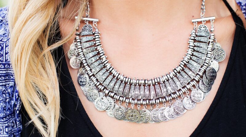
Accessories can strengthen a look or pull it away from the brand. A style guide should define preferred footwear, bags, jewelry, belts, eyewear, hats, socks, and hair or makeup direction when relevant. It should also identify styling boundaries.
- Which accessories are part of the brand language?
- Which accessories are acceptable only for seasonal campaigns?
- Which choices feel too formal, too casual, too decorative, or too trend-led?
- How many statement pieces can appear in one look before the outfit feels off-brand?
These rules are especially important for e-commerce styling, where the customer needs a clear view of the product and a believable idea of how to wear it.
Create rules for photography, video, and layout
Fashion is highly visual, so photography and layout rules should be among the most detailed parts of the guide. A consistent visual system helps customers recognize the brand even when the logo is absent.
Photography direction
Document the preferred lighting, background, framing, model direction, pose language, cropping, retouching level, and color treatment. Be precise. Instead of writing “natural,” explain whether that means daylight shadows, warm indoor light, clean studio light, or outdoor movement. Instead of writing “editorial,” explain whether the image should feel cinematic, quiet, spontaneous, polished, architectural, or intimate. See also: Fashion Trends.
Include rules for product-only images as well as styled campaign images. Product pages need clarity and accuracy. Editorial images can carry more mood. A good design style guide explains how these image types relate without forcing them to look identical.
Video and motion
Short-form video has become central to fashion communication, but the same brand rules still apply. Define camera movement, pacing, transitions, text overlays, music mood, close-up details, and how garments should move on the body. If the brand is calm and refined, fast cuts and heavy effects may feel inconsistent. If the brand is youth-driven and energetic, stillness may feel too distant.
The guide should also explain how video content differs by channel. A runway recap, a product detail clip, a styling tutorial, and a behind-the-scenes edit can use different formats while sharing the same visual principles.
Layout and composition
Layout rules connect photography, typography, and product information. Define spacing, image ratios, grid systems, caption placement, product card treatments, price styling, call-to-action buttons, and editorial page rhythm. In fashion, white space and image scale are not decorative details; they shape perceived value, clarity, and mood.
For digital layouts, include mobile examples. A lookbook page that feels elegant on desktop may become confusing on a phone if cropping, text hierarchy, or product links are not considered from the start.
Set the editorial voice and product copy rules
Fashion communication depends on language as much as imagery. A design style guide should include voice and copy rules so product names, collection descriptions, captions, emails, and editorial stories sound like they come from the same brand.
Voice attributes
Choose a small set of voice attributes and define what each one means in practice. “Confident” should not automatically mean loud. “Elegant” should not mean vague. “Playful” should not mean careless. Each attribute should include do-and-do-not examples.
- Clear: Describe fit, fabric, and use without unnecessary jargon.
- Considered: Explain styling choices with restraint rather than hype.
- Fashion-aware: Use industry terms accurately, but only when they help the reader.
- Customer-focused: Connect design details to how the garment feels, fits, or functions.
Product naming and descriptions
Product copy should be consistent enough to help customers compare garments. Decide how to name colors, silhouettes, lengths, fabric blends, fits, and collection references. If one page says “relaxed fit” and another says “easy fit” for the same cut, the customer may not understand whether the difference is meaningful.
A useful description pattern includes garment type, fit, material or texture, key design detail, styling suggestion, and care or use context when relevant. Avoid empty phrases such as “must-have,” “perfect for everything,” or “effortlessly stylish” unless the surrounding copy explains why.
Make the guide usable for different teams
The best guide is not the longest one. It is the one people actually use. A fashion brand often needs different teams to apply the same style logic in different ways, so structure matters.
Use examples, not just rules
For every major rule, include a correct example and an incorrect example. Show an approved outfit combination next to one that feels off-brand. Show a strong product page layout next to a cluttered one. Show the preferred caption tone next to copy that sounds too generic. Examples reduce interpretation problems and make the guide easier to follow under deadline pressure.
Create quick-reference sections
A detailed guide can include a shorter quick-reference page for daily use. This page might cover logo basics, core colors, image rules, copy tone, styling do-and-do-not notes, and approval contacts. Teams should not have to search through a long document for routine decisions.
Assign ownership
A design style guide needs an owner. That may be a creative director, brand manager, editor, design lead, or another responsible role. Ownership matters because fashion teams constantly face new situations: a collaboration, a pop-up event, a new model direction, a platform format, or a seasonal trend. Someone must decide whether the guide needs to expand or whether a one-time exception is enough.
Keep the guide current without chasing every trend
A fashion style guide should evolve, but it should not react to every trend. The maintenance process should protect the brand identity while allowing relevant change. Review the guide at planned intervals, especially after a major collection, rebrand, content shift, website redesign, or change in customer behavior.
During a review, look for three types of updates. First, remove rules that no longer reflect the brand. Second, clarify areas where teams keep making inconsistent decisions. Third, add examples from successful campaigns, product pages, or editorial stories that show the brand at its strongest.
It is also useful to keep a section for controlled experimentation. This can define where seasonal styling, trend-led colors, or new content formats are allowed. A brand can test fresh ideas without making the entire identity feel unstable.
Frequently asked questions
What is the difference between a design style guide and a brand guideline?
A brand guideline often covers the broader identity system, including mission, logo, typography, color, and tone. A design style guide is usually more practical and application-focused. In fashion, it should show how the identity appears in clothing styling, photography, product pages, editorial content, packaging, and digital layouts.
How long should a fashion design style guide be?
It should be long enough to answer recurring decisions clearly, but not so long that teams avoid using it. A small brand may need a concise guide with strong examples, while a larger fashion business may need separate sections for product, e-commerce, campaigns, social media, and editorial content.
Should a design style guide include trend rules?
Yes, but trend rules should be separated from core identity rules. Trends can influence seasonal color, styling, props, or content formats, but they should not overwrite the brand’s permanent codes unless the brand is intentionally repositioning.
Who should use the guide?
Designers, stylists, photographers, editors, copywriters, merchandisers, marketers, web designers, and social media teams can all use it. Any person making customer-facing creative decisions should understand the guide’s main rules.
When should the guide be updated?
Update it after major creative changes, new collection directions, website redesigns, recurring consistency problems, or planned brand reviews. Minor seasonal changes can be added as examples without rewriting the entire guide.